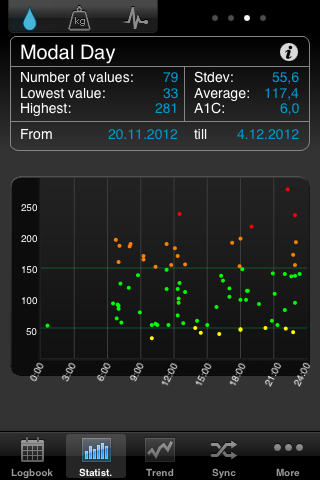
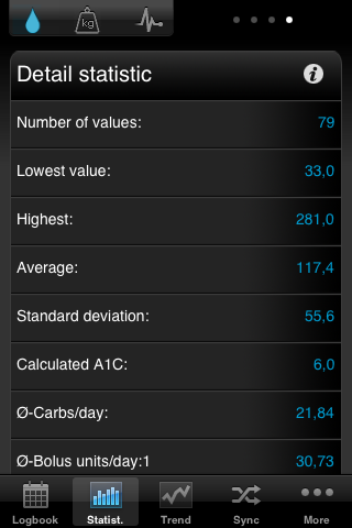
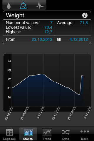
"It HELPS ME WITH THE ANALYSIS"
SiDiary also runs in your practice network
SiDiary also runs in your practice network
Data storage location', in which of your shared folder in the network the patient data should be stored.
The stored data can be viewed on any computer in the network, and it's also easy to integrate the stored data in your backup strategy.
... »»»
"THE STATISTICS COVER EVERYTHING I NEED TO KNOW"
SiDiary supports users of insulin pumps
SiDiary supports users of insulin pumps
A therapy change or a new base adjustment with a pump is done ideally at home because there you have all the "real" conditions. Therefore, it is pretty good to provide your data contemporary to your doctor. With your electronic logbook, a simple change can be easily d »»»
"SMART AND GREAT TO HANDLE"
SiDiary supports blind people with diabetes
SiDiary supports blind people with diabetes
"SO EASY - EVEN DAD CAN DO IT"
SiDiary supports kids & teens with diabetes
SiDiary supports kids & teens with diabetes
If your child is away from home and tracks a critical reading, the parents can get informed with a direct E-Mail message on their mobile phone. They can call back with instructions on how to handle this situation. The trusted person and the E-Mail address, alo »»»
"I FEEL FIT AS A FIDDLE"
SiDiary supports women with gestational diabetes
SiDiary supports women with gestational diabetes
This type of diabetes is formed back in most cases, but the mother has to live with an increased risk to getting a diabetes type 2.
The higher blood glucose levels are transfused through the umbilical cord to the baby, that now starts to produce more insulin and to store the excessi »»»
"I WANT TO STAY FIT INTO OLD AGE!"
SiDiary supports people with type 2 diabetes
SiDiary supports people with type 2 diabetes
Little diabetes software are providing the possibility to track pills as well as insulin together as a combination. With SiDiary you can track information, when you have taken your pills, how much of them and also when you took your insulin shots.
This means that for changes »»»
"LIVING A SIMPLE LIFE WITH DIABETES"
SiDiary supports people with type 1 diabetes
SiDiary supports people with type 1 diabetes
This means that they must inject a long acting insulin for their basal need and additional injections with a fast acting insulin type for every carb intake.
- Before every carb intake
- At the evening before going to bed
You are enjoying a meal in your favorite restaurant and estimate »»»
"CONTROL YOUR DIABETES WITH SIDIARY"
The intelligent diabetes management
The intelligent diabetes management
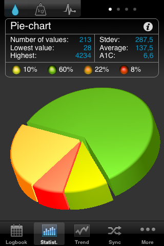
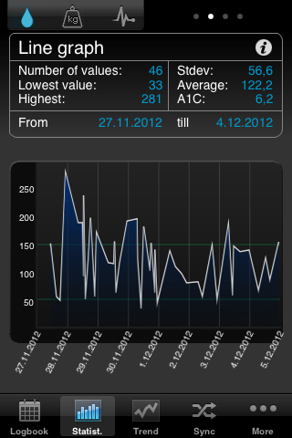
SiDiary makes the management of diabetes so much easier. Data capturing is a cinch and analysis will help to improve your therapy. We have included great new features with version 6 to help you to get started in the easiest way ever possible, even for computer rookies! »»»


