English Online Help Topic Line Graph
6.6.2.2 Line Graph
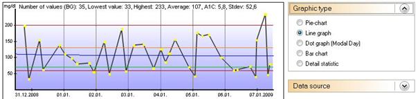
The trend of your blood glucose values is graphically displayed with the
line graph. Each dot represents a tracked value. If you keep the cursor over a
dot you can see the appropriate details. When you click on a dot SiDiary opens
the exact day (so you are able to analyze very quickly a trend, without looking
at each day). You can also add information about bread unit or bolus, when you
select them as the data source.
You can see in this example the upper marker (red line) is 200 mg/dl and
the lower marker is 60 mg/dl. You can adjust these limits in the menu Diabetesprofile → Therapy
details and goals (F3) → Low and High blood
sugar limit.
The orange line is the individual upper limit of the target range; the
lower green line is the lower limit. These limits are adjustable in your
therapy details, which you can open with the F3-button or you click on Diabetesprofile
→ Therapy details and goals.
The fat blue line, which passes in our example above diagonal through the
graphic shows you the trend of your blood glucose level. In this
example it's a decreasing trend.
The Y-axis (level of the blood glucose) is dynamic, which means it is
adjusted to the present values of this time range (see also Settings below).